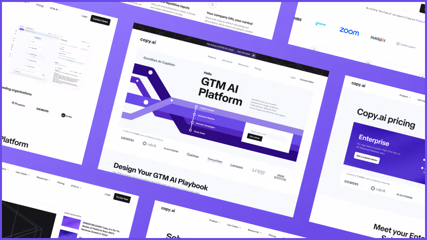

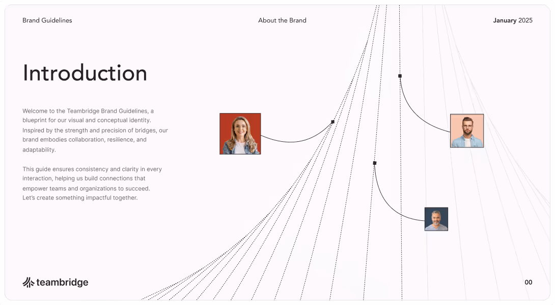
From rebrand to autonomy in a few short months
Teambridge partnered with Zabal Media to rethink its brand expression and migrate away from a tangled, plugin-heavy WordPress site to a more accessible web platform. The result is a modular Webflow system that mirrors the company’s intelligent, AI-driven product: flexible, intuitive, and built for growth.
Backed by a $28 million Series B funding round led by Mayfield with participation from General Catalyst and Abstract Ventures, Teambridge was scaling quickly and needed a digital presence that could keep up. Working closely with Josh Hornthal, Head of Marketing, and the company’s founder (who led brand direction), Zabal helped transform Teambridge’s online experience into a marketing ecosystem the team could truly own. The new site empowers their non-technical marketing team to publish, adapt, and grow without relying on developers, turning what used to be a bottleneck into a source of momentum.

Understanding the business
Understanding the business
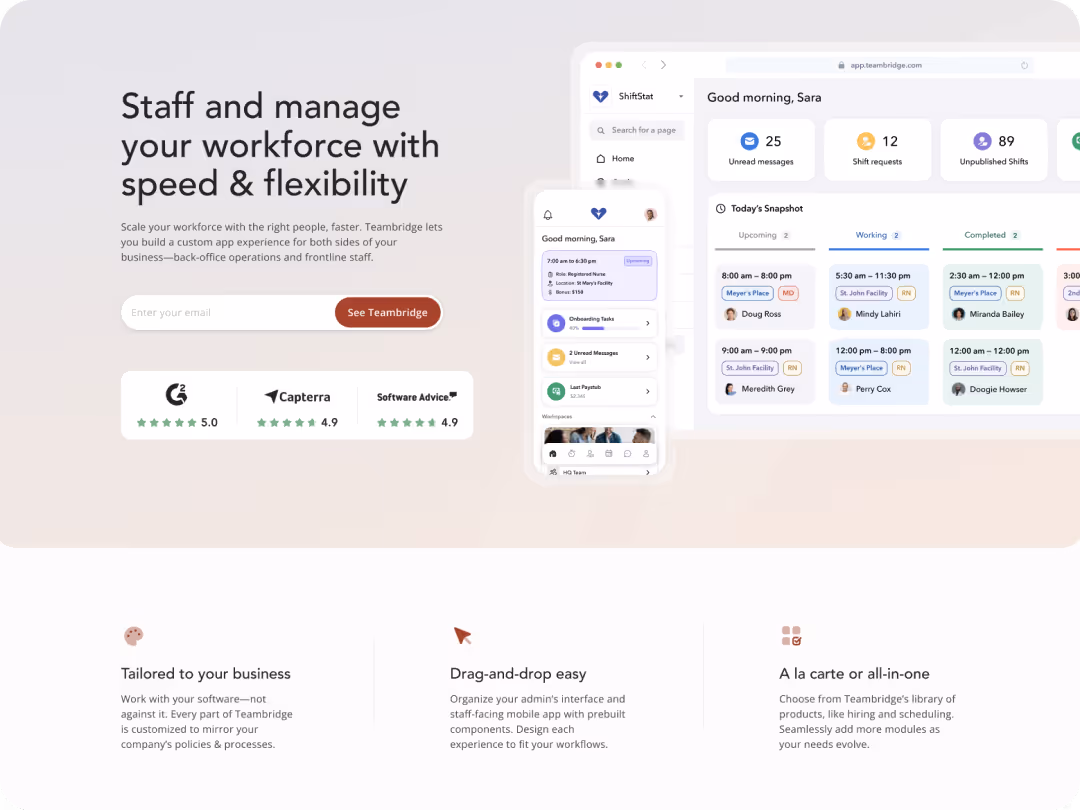
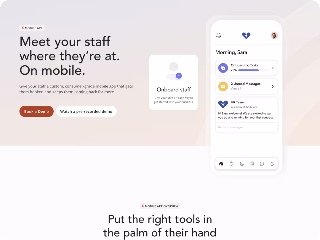
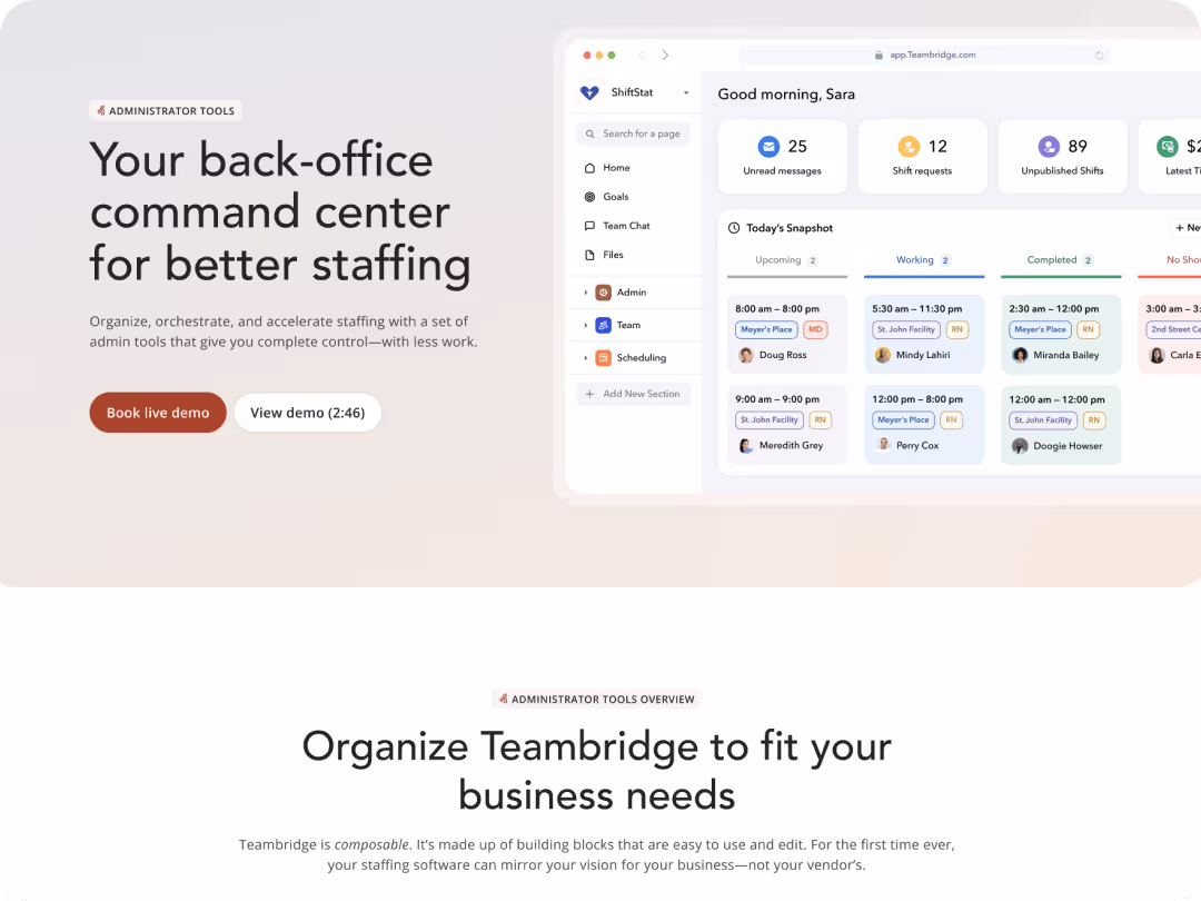
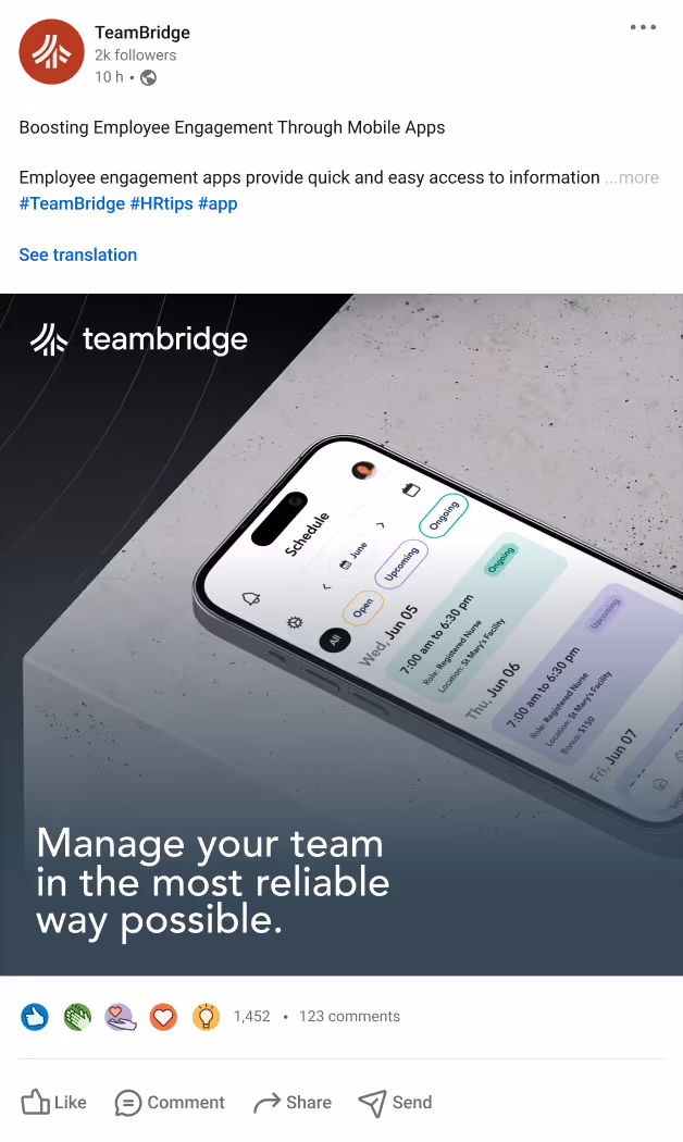
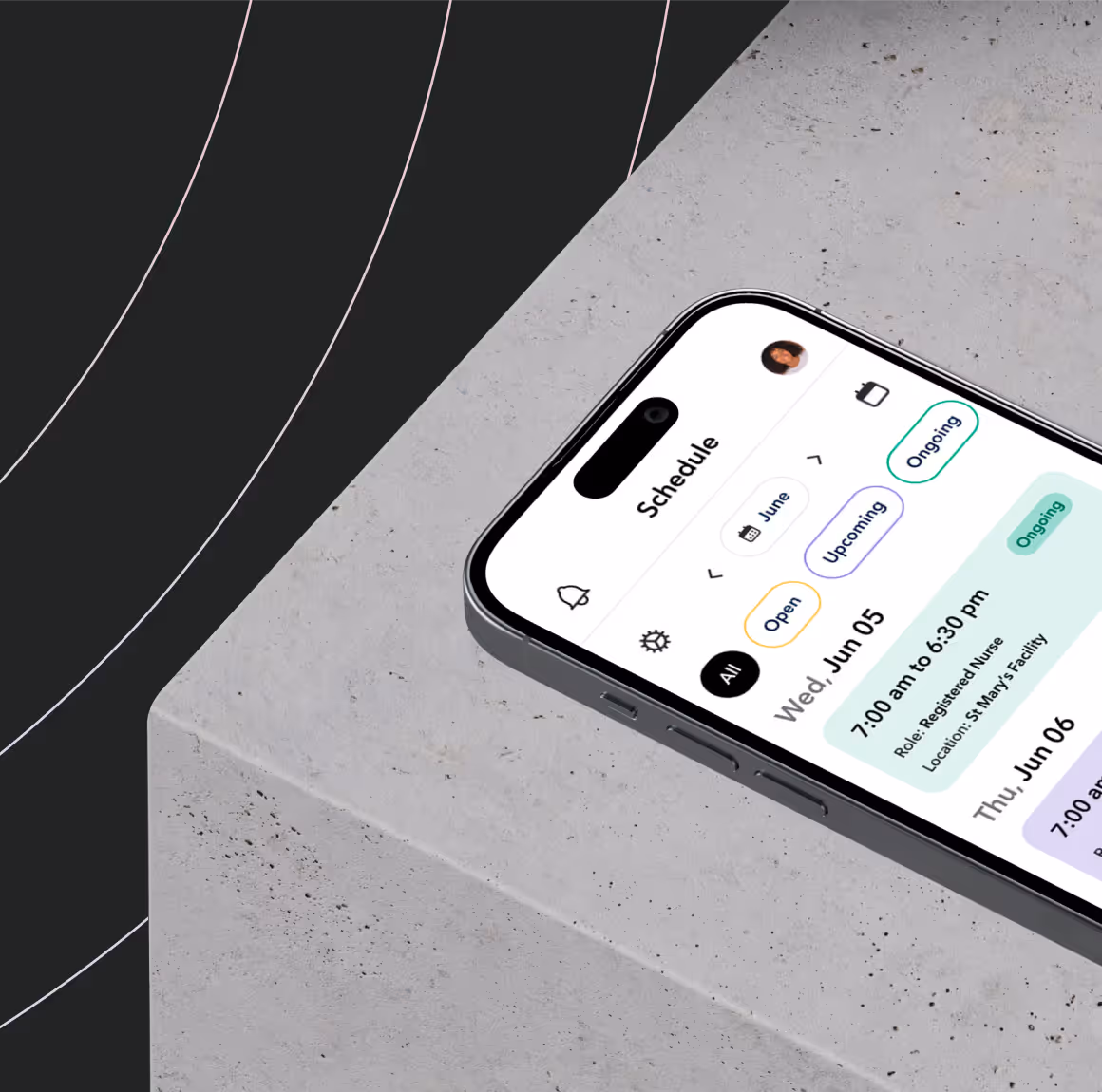
Teambridge is an AI-native workforce management platform that unifies scheduling, communication, and operations in one system. Built for staffing agencies, especially in healthcare and light industrial sectors, it helps organizations operate at the speed their industries demand. In markets where talent can easily switch employers or platforms, Teambridge gives agencies a competitive edge through automation, mobile accessibility, and intuitive design. Its no-code, composable architecture enables companies to streamline complex workflows, adapt quickly to changing needs, and digitize their unique processes, empowering teams to work more efficiently and focus on what matters most: people.


Business challenge
The original WordPress site was holding them back. It consisted of roughly ten disconnected pages dependent on fragile third-party plugins and a tangled web of legacy code, which caused frequent crashes and made publishing risky. Even minor content updates required developer help. The lack of consistency and scalability limited growth and slowed campaigns. As Teambridge prepared to reach a larger audience, they needed a stable foundation that delivered reliability, visual polish, and freedom to scale without technical barriers.
Business goals
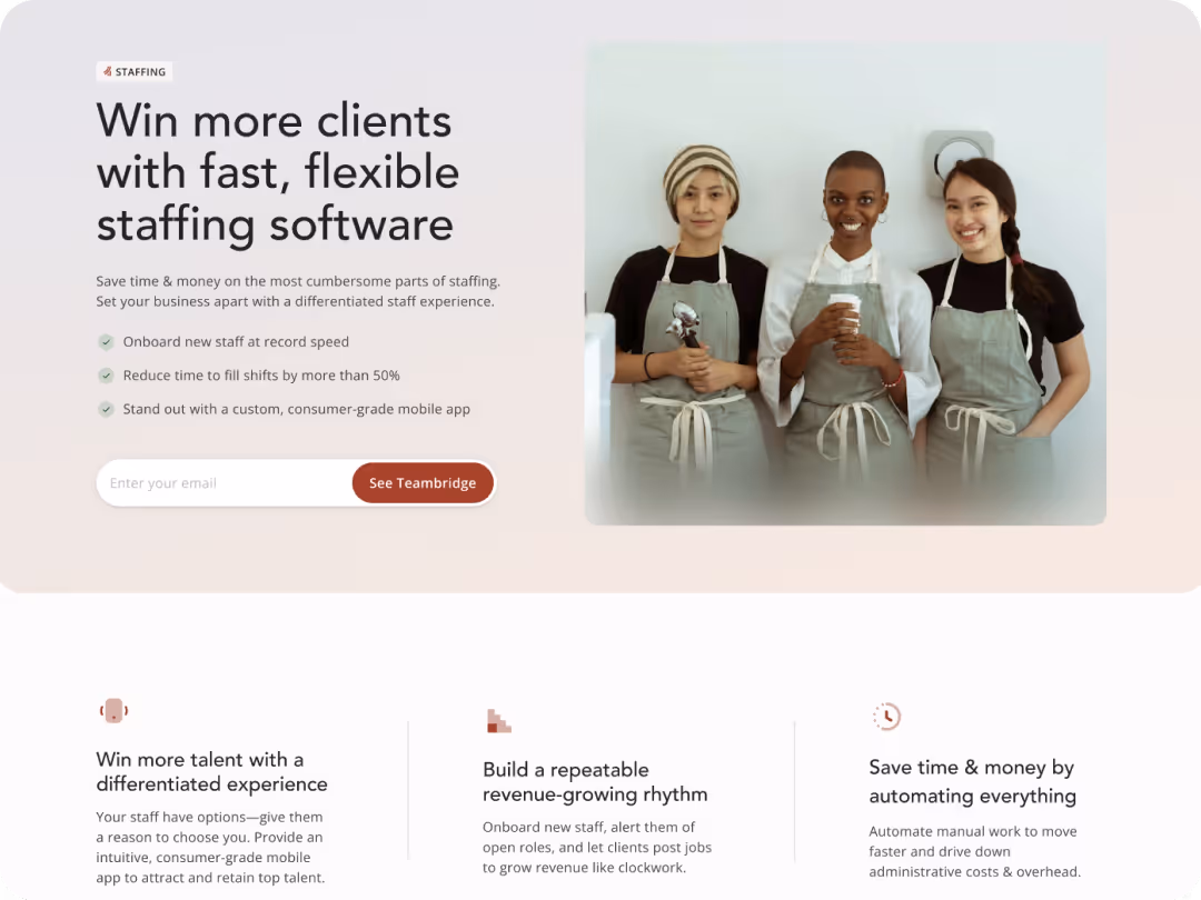
Teambridge wanted to move away from WordPress and into a platform their marketing team could fully manage. They needed the freedom to build, launch, and edit pages without developer support, reducing bottlenecks and increasing speed. At the same time, the company sought to evolve its brand and visual identity to attract more midmarket and enterprise clients. The goal was to create a stronger, more credible digital presence that reflected the intelligence of their product, captured the attention of high-value prospects, and provided a scalable foundation for growth as their business continued to expand.

Asking the right questions
Research goals
The research phase focused on understanding Teambridge’s brand, audience, and market position. Zabal began by reviewing the brand intake to clarify what the company does, who it serves, and what makes it stand out in the staffing technology space. The team audited competitor websites to analyze how others presented their products and to uncover opportunities for differentiation. Stakeholder interviews with Josh, Head of Marketing, and the Founder clarified how the brand should evolve and why. These insights guided a Webflow redesign focused on clarity, scalability, and conversion, positioning the brand for long-term growth.
Inconsistent Design Weakened Brand Trust
The existing website’s inconsistent visuals and dense copy weakened brand trust and made it difficult for users to understand value quickly.
Competitor Clarity Highlighted a Gap
Competitor sites in the staffing technology space presented their platforms with greater clarity and confidence, creating an opportunity for distinction.
Unclear Hierarchy Reduced Conversions
User journeys lacked clear conversion paths and visual hierarchy to guide visitors toward demos or proof points.
Unified System Strengthened Brand Trust
A cohesive design system and Webflow rebuild would bring structure, brand clarity, and usability while positioning Teambridge as a category leader
Interface inspirations

Defining a visual direction
Zabal benchmarked leading SaaS and workforce management platforms to understand what clarity and confidence look like online. The takeaway was simple: brands that communicate technical sophistication best are also the most approachable. For Teambridge, this meant clean typography, smart use of motion, and visual storytelling that humanized their AI narrative. The new direction combined structure with warmth, creating a brand experience that feels both intelligent and inviting.
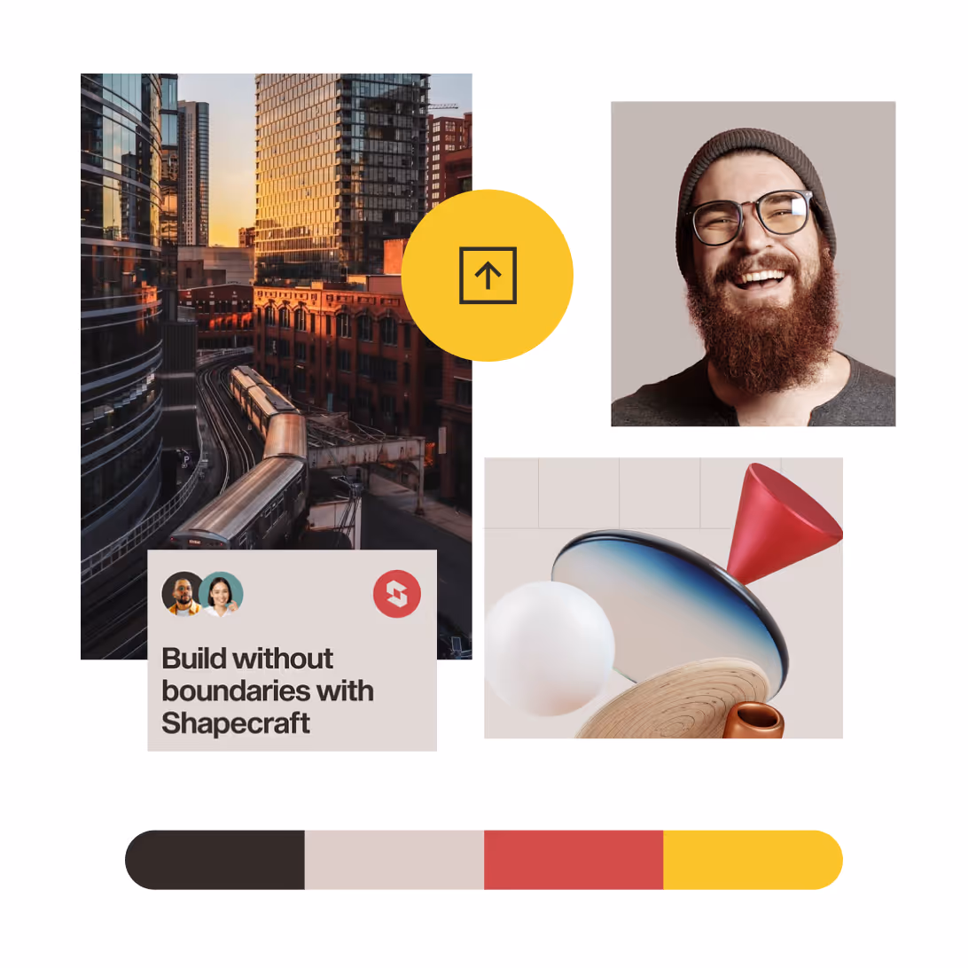
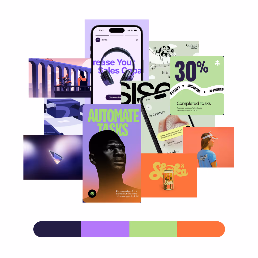
A Mood Board Showcase
The interface mood board combined visual references from leading enterprise SaaS products and creative startups to define Teambridge’s desired tone: confident, clear, and human. Every frame explored modularity and movement, connecting data visualization, messaging, and scheduling into one seamless ecosystem. Zabal focused on creating interfaces that balance structure with emotion, strong enough for enterprise yet approachable for everyday users. By analyzing type scales, iconography, motion, and grid systems, the team built a foundation for an interface that feels intuitive and inspiring. The result guided the visual direction toward a design language that communicates trust, clarity, and momentum.
Brand Design exploration
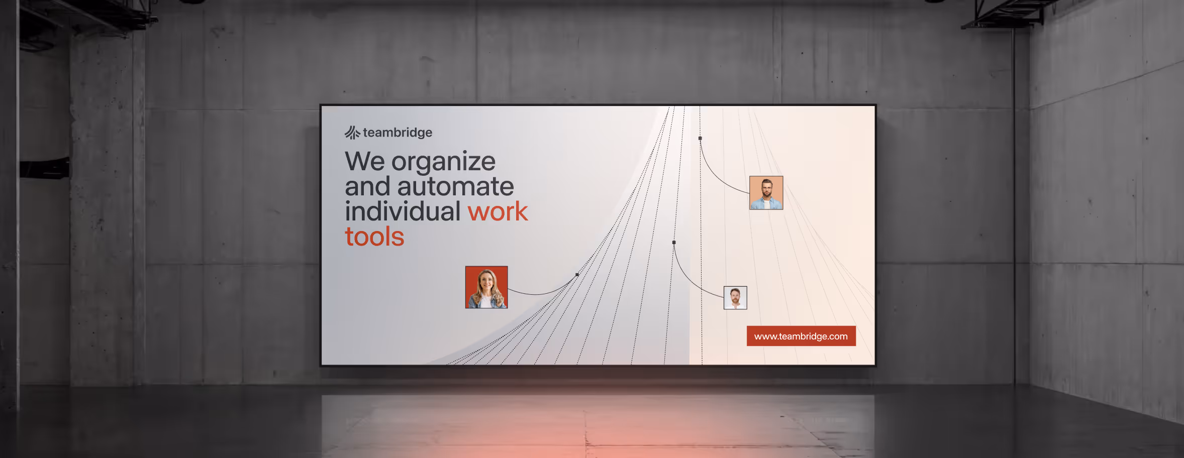
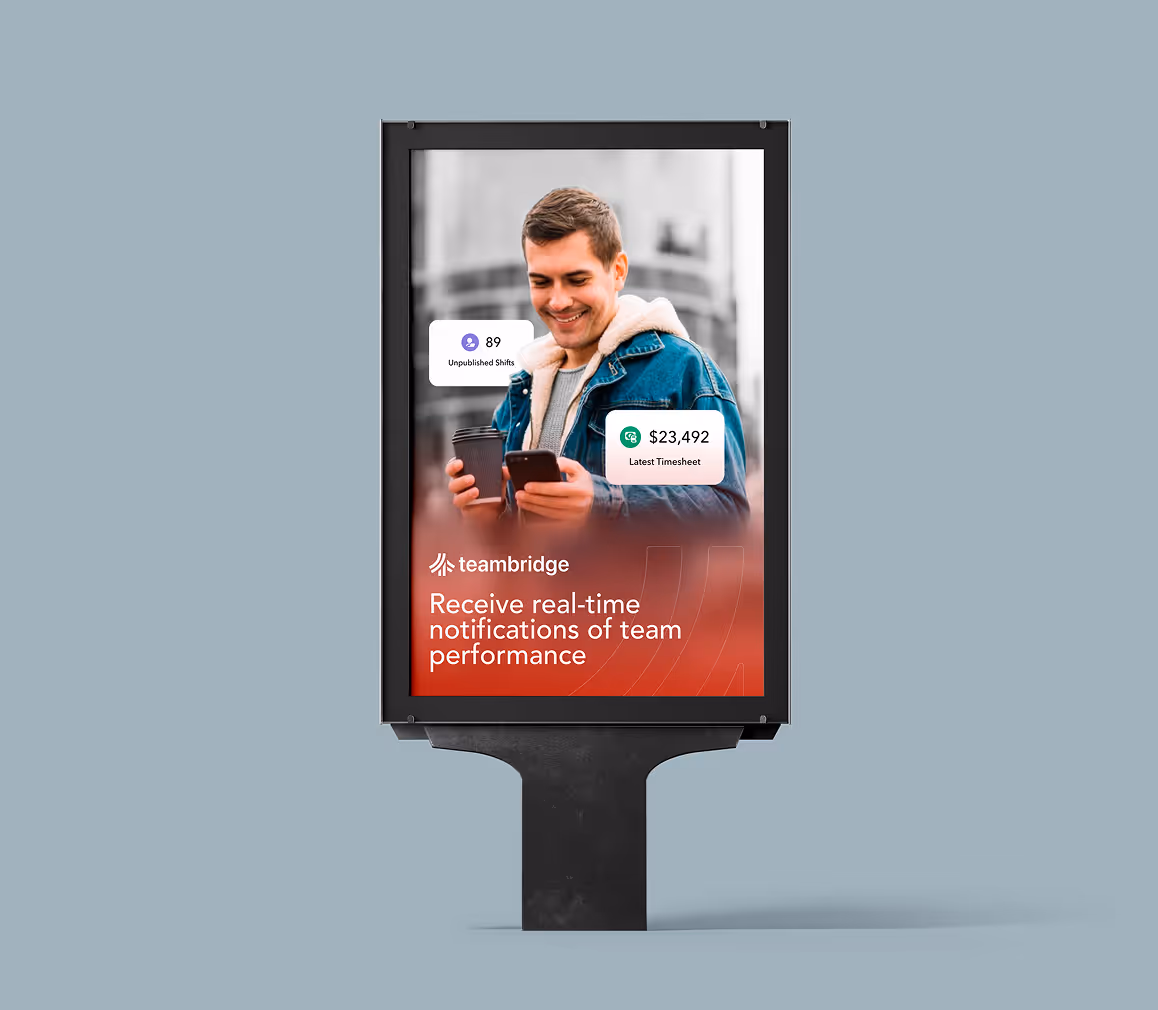
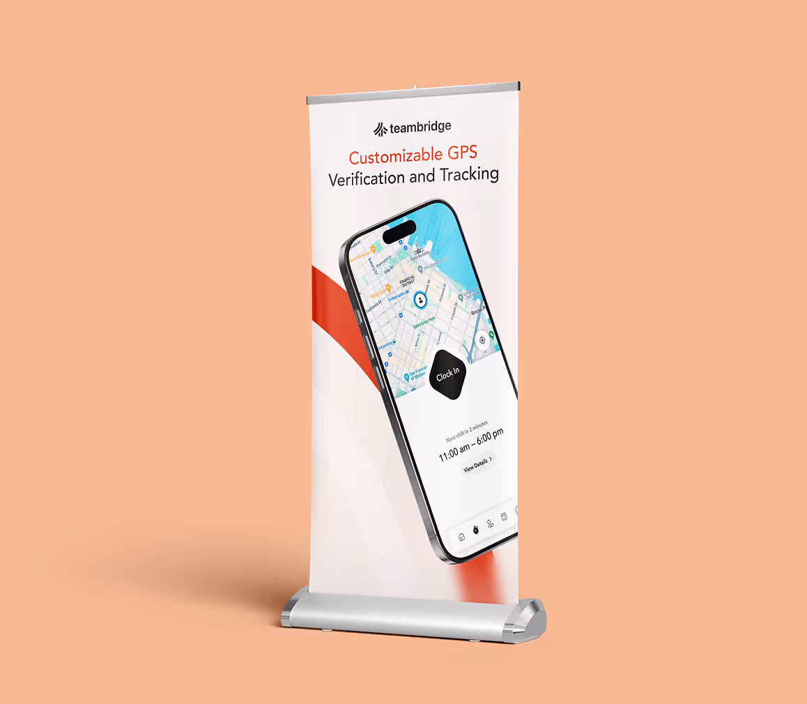
The final design system balances precision with personality. Typography conveys focus and confidence, while color and spacing bring clarity and energy. Imagery highlights real-world use cases to keep the experience authentic and relatable. Micro-animations and motion create a sense of momentum, mirroring the way Teambridge helps teams operate faster and more smoothly. Every component was built for reuse, ensuring that new pages always feel on-brand and visually cohesive.
Design System in Motion
Every component in Teambridge’s visual language was designed for flexibility, speed, and structure. From typography and iconography to responsive motion, Zabal built a cohesive framework that scales seamlessly across digital touchpoints. The system creates rhythm and clarity, ensuring each interaction feels intuitive and unified. This foundation keeps every new page visually consistent while empowering the marketing team to expand without friction.
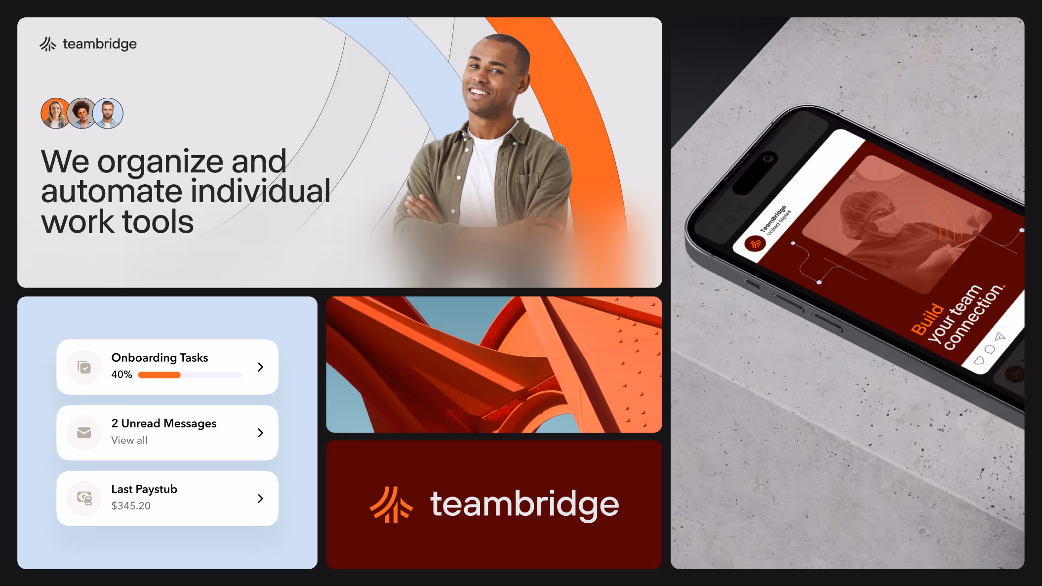
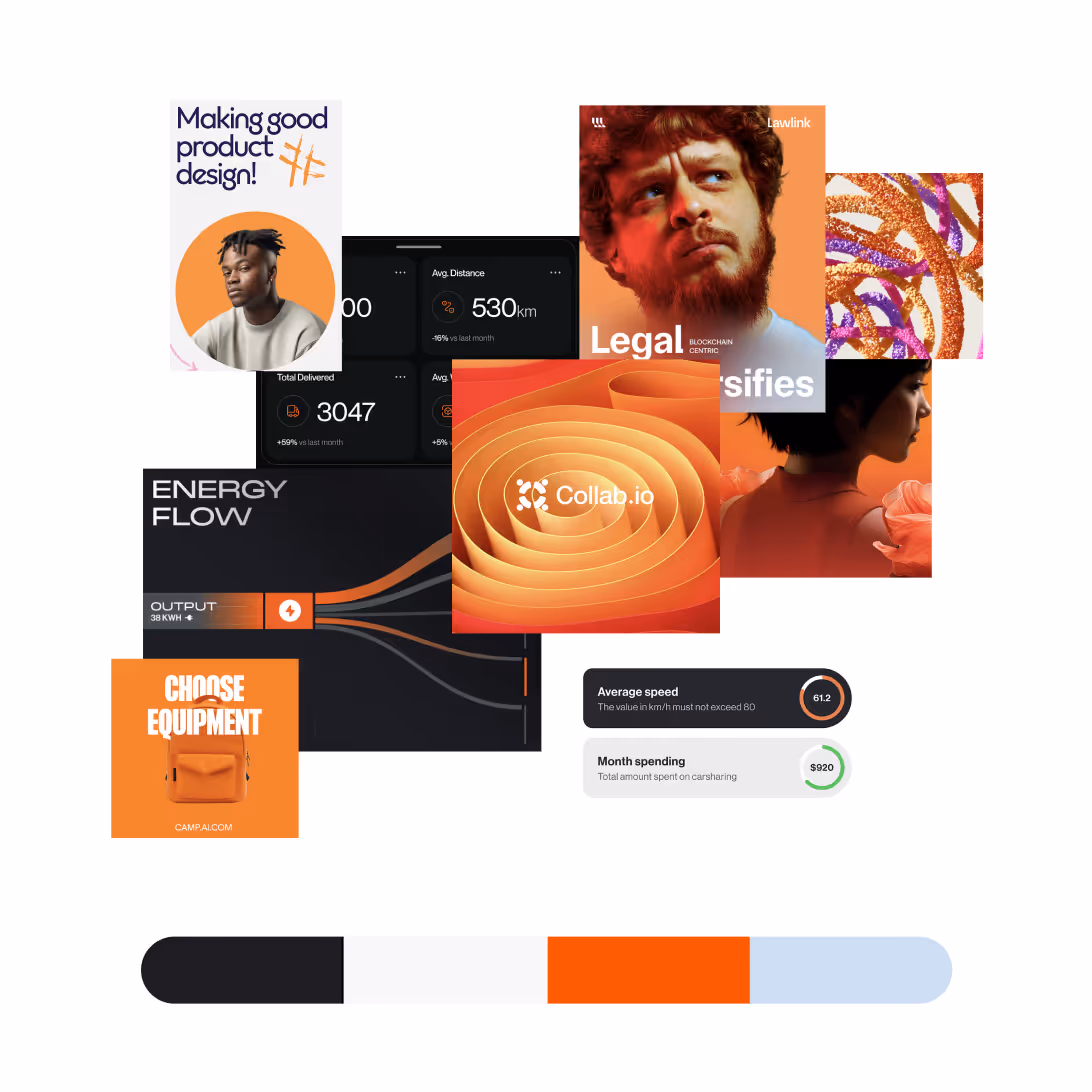
The first direction explored modularity through movement. Bold shapes and gradients reflected data and collaboration. Energetic and playful, it captured Teambridge’s startup spirit but felt too experimental, revealing the need for clarity and structure to ground the brand identity.
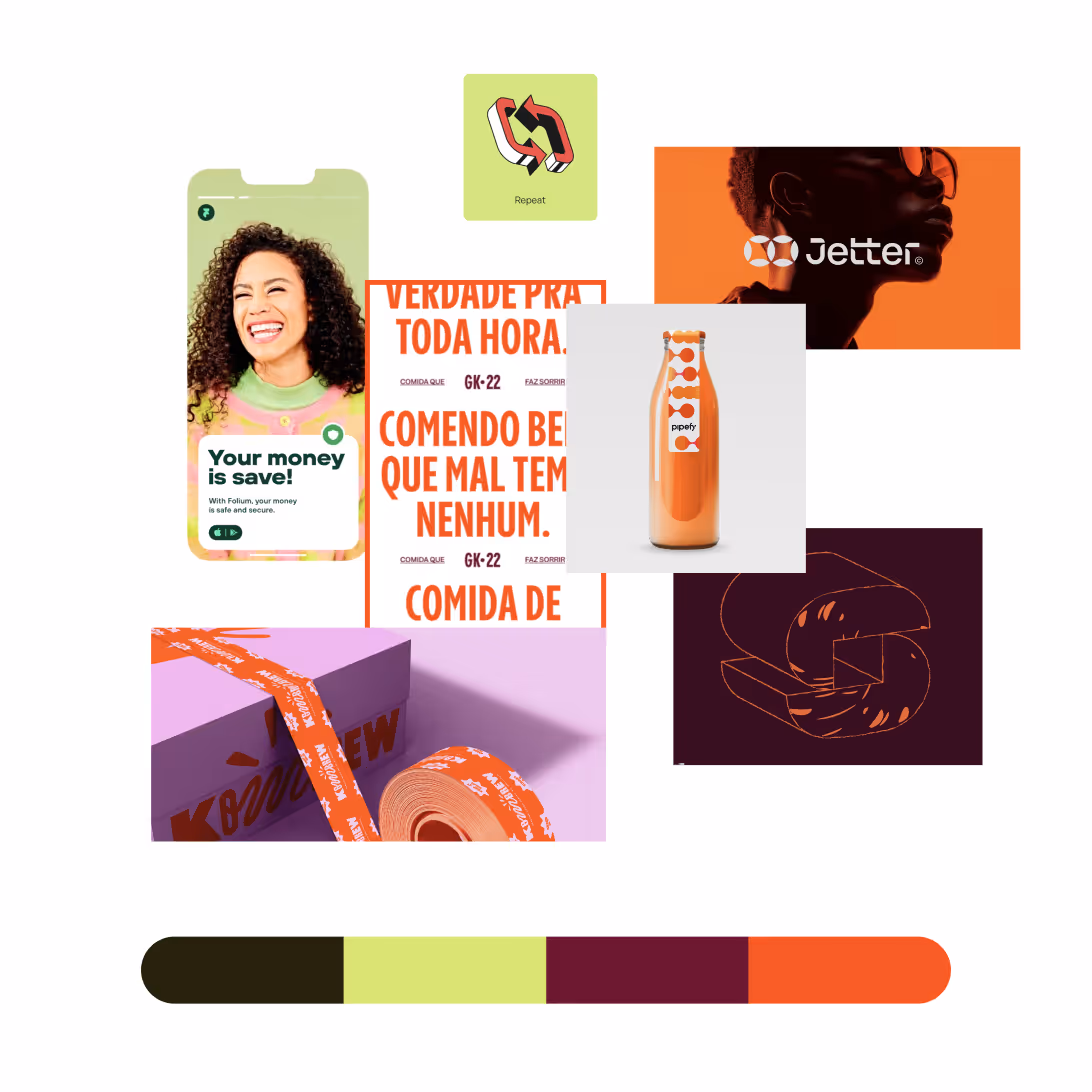
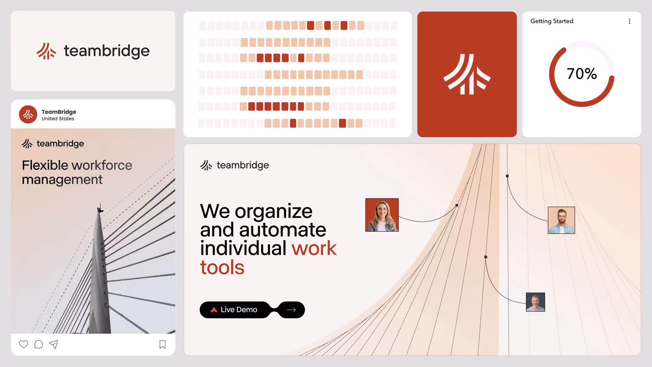
Direction 2 explored the balance between system and story. Soft color accents, round iconography, and conversational micro-copy introduced approachability without losing professionalism. The interface feels alive yet trustworthy, designed for people who manage complex work but still value warmth and personality in every interaction.
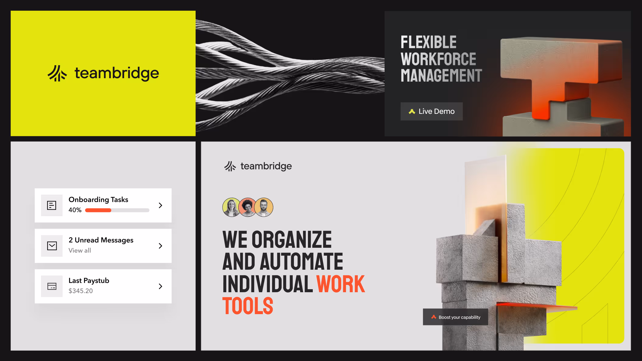
Dynamic transitions and responsive layering gave Direction 3 a sense of forward motion. Each animation reflects the real-time flow of scheduling, messaging, and reporting inside Teambridge. The result is an interface that never feels static, speed and clarity become part of the visual identity, turning efficiency into visible momentum.
New Brand Guidelines
The new system gives teams clear visual rules that simplify creation and keep work consistent across channels, supporting growth with clarity and focus.
New Brand Guidelines
The new brand guidelines translate the visual language into a practical system for internal teams. It includes clear rules for logo usage, spacing, type scales, color palette, and iconography to ensure consistency across digital and print. Each component is built for flexibility so as the platform evolves, the visual foundation stays intact. Accessibility standards, responsive behavior, and best practices are documented to maintain quality and alignment. The guide also covers tone of voice, photography, and social media, enabling the marketing team to create on-brand assets while preserving design integrity across channels.


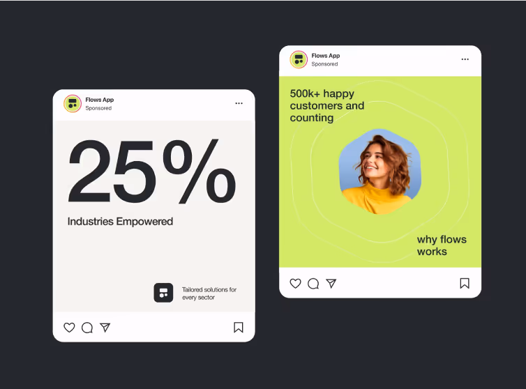
Social Media Captions
Social media assets extended the Teambridge brand beyond the product. Posts were designed to feel bold and confident while remaining human and relatable. Photography and motion reinforced the idea of connection; people, ideas, and technology working in sync. Templates were optimized for speed, adaptability, and cohesion, giving the marketing team tools to create campaigns that scale quickly and stay consistent. Each post followed the same design principles as the core website; clarity, composability, and accessibility. The result is a social presence that mirrors the brand’s culture of innovation and collaboration, maintaining a unified tone, rhythm, and visual identity across every channel, platform, and interaction. Guidelines and templates ensure continuity over time, so teams can iterate confidently and measure impacts across campaigns.
Scroll Animations
Brought the Interface to Life
Motion served as both design and storytelling. Zabal implemented scroll-triggered animations that visualize how Teambridge operates; smooth, precise, and continuous. As users move through the page, content reveals itself progressively, echoing the flow of information within the platform. These transitions keep attention while reducing cognitive load, helping complex data feel intuitive. The animation framework is light, performant, and reusable, creating visual harmony that aligns with the platform’s rhythm and responsiveness.
Visual design guidelines
Consistency That Scales Across Every Touchpoint
The visual guidelines translate TeamBridge’s evolving identity into a unified system that internal teams can apply effortlessly. Each rule: spacing, typography, color, motion and was built to ensure clarity and accessibility across every platform. The framework documents contrast ratios, component behavior, and responsive states so designers, developers, and marketers can work in sync. From dashboard interfaces to recruitment pages, every asset maintains the same rhythm, proportions, and energy. By pairing visual precision with flexible rules, Zabal created a design language that scales globally without losing personality, empowering TeamBridge’s brand to feel cohesive, human, and future-ready.
IMPLEMENTATION
Custom Webflow development
Given that we support software and technology companies, we tend to see similar development requirements across projects. Familiarity and past experience creates efficiency for the client! But in some cases, we receive unique requests requiring custom development. We're always up for the challenge given our large webflow-certified development team's collective skills.
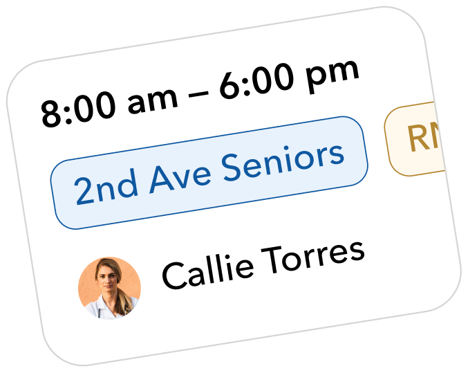
Before & After Custom Slider
The Zabal team creates a wide range of static visuals, motion graphics, Webflow interactions, and custom UI elements designed to increase visitor engagement. In this example, our design and development teams collaborated to create a custom interactive slider. The left side demonstrates how Teambridge presents job openings in a more engaging and informative format by including photos, hiring department details, location information, and role start dates. The right side illustrates how many competing solutions typically display job listings.
At Zabal, we believe it's important to surface key product differentiators and showcase product functionality in a way that is simple, intuitive, and easy for users to understand. That's why we invest time early in the process to develop a deep understanding of your product, its capabilities, and the value it delivers to customers.


Ashby 3rd Party Integration for Careers
Teambridge uses Ashby, an all-in-one recruiting software platform for managing hiring. Its AI-powered outreach, automated scheduling, strong analytics, customizable workflows, and easy onboarding for new recruiters makes it a great fit for many of Zabal's software and technology clients. Zabal's development team regularly integrates Ashby career listings with our clients' career pages so that they remain dynamic and up-to-date even in fast-paced, high-growth environments.
“Our work with Ashby creates a smooth, consistent experience for applicants by blending their platform with Teambridge’s visual system.”
— Nathan Halpern, Director of Design
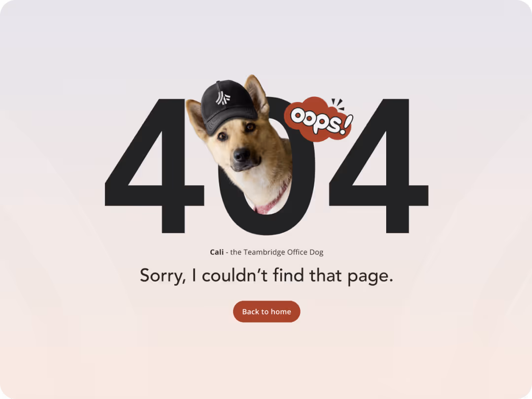
We have crafted over 30 pages and templates, and we are delighted to showcase the most captivating ones to you.
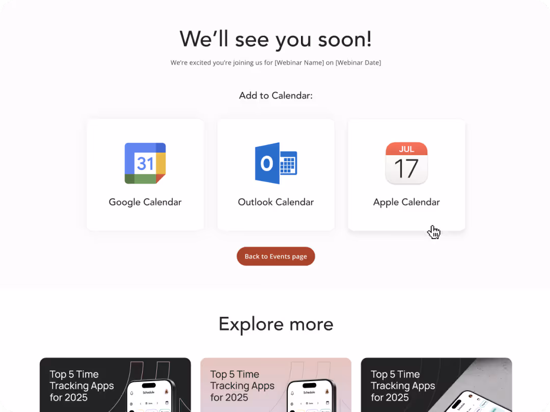
After launch, Teambridge’s website expanded from ten static pages to more than one hundred dynamic pages. Weekly traffic grew tenfold. The site introduced six new conversion paths, including newsletter signups, gated content, and webinar registrations, creating measurable engagement opportunities. Most importantly, the marketing team now publishes freely, launching pages in hours instead of weeks. The new digital foundation supports ongoing storytelling and has become a reliable growth engine for the company.
We asked Zabal to throw out what little existed of our brand and website and build something entirely new. They challenged our thinking, pushed us creatively, and delivered a platform that truly scales with us. We’ve gone from a handful of static WordPress pages to a living Webflow ecosystem with over a hundred pages and ten times the traffic. More importantly, our non-technical team can now publish, experiment, and grow with confidence.
Like what you see? Don't let your website idle another day
START A PROJECT